Combobox
Form elements – Abstract
A combobox offers the user the possibility to pick out a specific entry via a dropdown list and select it as field value.
►NOTE◄ The following description of general configuration options for a combobox element assume that the element type 'Default' is used, which combines an input field with a dropdown list. Instead, the element type 'Options' could be used, which is described in a dedicated section below. As far as a technically applicable, configuration options apply for both choices of element type.
'Default' (combobox) element type
A combobox element enables the user to pick an entry from a list of options presented as a dropdown list.
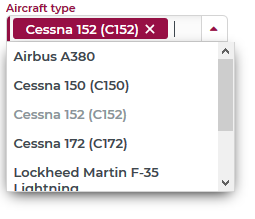
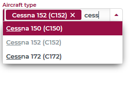
The following examples show a combobox for selecting a specific Aircraft type:
In the first image, the dropdown menu was opened to show all available options. The already selected option appears grey in the list. Selecting this option clears the selection.
In the second image, the characters 'cess' have been typed into the input field, which reduces choices in the dropdown to options that include this string.
Assign the data source for available entries
►NOTE◄ The configuration options described here apply in full for comboboxes in portals and only partially for comboboxes in input forms for business objects.
The configuration of the so-called 'Service info' defines which entries appear as options in the dropdown.

The Allow empty selection option defines whether the user is allowed to clear the selection by removing a selected option. This is not to be confused with a 'Required' constraint for the data field or a validation rule of that nature. With this option unchecked, the label of a selected value does not feature the 'X' symbol for 'delete'. It is also impossible to remove an item from the selection by pressing the 'Del' or 'Backspace' key.
The Allow custom values option defines whether the user may enter custom values instead of selecting from the dropdown menu.
The Disable search, option which is also available in input forms for business objects, enables/disables the 'search' mode for the input field.
Clicking the Add service info button opens an additional section with configuration options for a 'service', i.e. a predefined method to resolve a list of entries.
The following screenshot shows an example of where a special 'UnitService', designed to return all types of Units, is used to return the Weight & mass units provided in a dynamic enumeration.

Include/Exclude entries
Once the service is configured properly, the Reload button can be clicked to update the list of options for an element. Services with a defined list of entries support detailed specifications in the Active entries section:

In this example, the entries for 'Microgram', 'Milligram' and 'Nanogram' were deactivated, so they do not appear in the dropdown menu.
The option include new values specifies that new additions to the list of Weight & mass units (dynamic enumeration) will appear in the dropdown, even if they are not featured in the list of 'Active entries'. Alternatively, a choice of exclude new values in this dropdown would specify that additions to the dynamic enumeration would be considered 'inactive' unless explicitly activated.
►IMPORTANT◄ Changes in the configuration on the level of 'Active entries' do not become effective until the Apply item config button is pressed.
Controlling dropdown options by dynamic enum filters
Whenever Enumerations provide data for a combobox, Enumeration filters may constrain the availability of options in a specific data context. Each of these filters defines a specific subset of all elements in a certain dynamic enumeration. A filter is regarded as applicable if it refers to the same dynamic enumeration as the combobox and at least one of the assigned Association criteria evaluates to 'true' in the given context. According to this definition, multiple filters may turn out 'applicable' for the same combobox. The impact on choices in the dropdown depends on the choice for 'Enum filter mode' with three options (empty, AND, OR).

|
Enum filter mode |
Effect |
|
empty |
From all applicable Enumeration filters (if any), only the single one with the highest priority score of matching Association criteria is considered. Only entries of the dynamic enumeration included in this filter appear in the dropdown. |
|
AND |
All relevant Enumeration filters are considered and the dropdown features only entries included in ALL of these filters. An intersection is therefore formed from the subsets defined via the applicable filters or their selection criteria are AND-linked. |
|
OR |
All relevant Enumeration filters are considered and the dropdown features all entries included by ANY of these filters. A union set is therefore formed from the subsets defined via the applicable filters or their selection criteria are OR-linked. |
Practical example:
Dynamic enumeration 'Means of transportation' features the options 'Car', 'Truck', 'Ship', 'Bicycle'
Dynamic enumeration filter #1 includes 'Car', 'Truck'
Dynamic enumeration filter #2 includes 'Ship', 'Truck'
We assume that the association criteria for both filters match:
Enumeration mode AND: ... intersection of the result sets of both filters: {'Car'}
The dropdown shows all elements to include according to filter #1 AND filter #2.
Enumeration mode OR: ... union of the result sets ({'Car', 'Truck'} and {'Ship', 'Truck'}) of both filters: {'Car', 'Ship', 'Truck'}
The dropdown shows all elements to include according to filter #1 OR filter #2.
'Options' element type
Instead of the default representation with a dropdown, a combobox element can be configured as a set of options ('radio button'), showing all options simultaneously (as shown in picture):
|
'Default' element type |
'Options' element type |
|
|
|


The Element type is defined in the Common section of the property editor.
Specific settings for element type 'Options' are available in the Option elements section.

The effects of these settings are explained in the following table:
|
Option |
Effect when true |
Effect when false |
Remarks |
|
Align vertical |
Vertical alignment of elements:
|
Horizontal alignment of elements:
|
n/a |
|
Options can wrap |
Options populate multiple rows, if necessary:
|
Options appear in the same row even beyond the assigned width:
|
|
|
Display option labels |
Options appear without labels:
|
Options appear with labels:
|
|


Along with selecting an option with the mouse cursor, it is also possible to use the keyboard. When the option group has focus, the arrow (left/right or up/down) keys rotate the option-cursor between options. Pressing 'Enter' or 'Space', toggles the option status (selected/deselected). Pressing 'Tab' moves the focus from the option group to the following element.
In the following screenshot option 'Truck 40t' is selected, the option-cursor marks 'Truck 7.5t' and pressing 'Enter' or 'Space' would move the 'option bug' to 'Truck 7.5t'.

►NOTE◄ The 'Options' element type was designed to handle moderate numbers of entries and – unlike a dropdown – does not feature paging nor searching.
►NOTE◄ With the 'Allow empty selection' option checked, the selected option can be deselected without selecting another one.